Six Months Is Long Enough to Learn What Matters
Family Dashboard moved from Vercel to a Raspberry Pi in April 2026. At the time, the motivation was latency: an Express server running on the local network could proxy OpenWeatherMap and CalDAV requests without the cold-start delay that Vercel introduced on an older iPad that rarely reloaded the page. The move worked — initial load time dropped noticeably, and the service worker cache kept the display stable through Pi reboots.
What the move also did was make the dashboard's shortcomings more visible. When a web app lives in a browser tab that you open occasionally, display quality is a background concern. When it lives on a wall in the room where your family starts and ends every day, every rough edge becomes obvious. Six months of that kind of exposure surfaces a different class of bugs than six months of developer testing.
The list of things that surfaced was long: events from shared Google Calendar invitations not appearing (fixed in May with CalDAV collection discovery), the wind direction panel showing a static default instead of live data when the forecast endpoint returned wind data on a different object path (fixed in June), the weather summary text generating a trailing commentary sentence that added filler where there should have been negative space.
v3.34 addresses the last one.
What the Update Actually Changed
The July 10 commit is two changes bundled into one PR. Both touch the weather summary display rendered at the bottom of the weather panel:
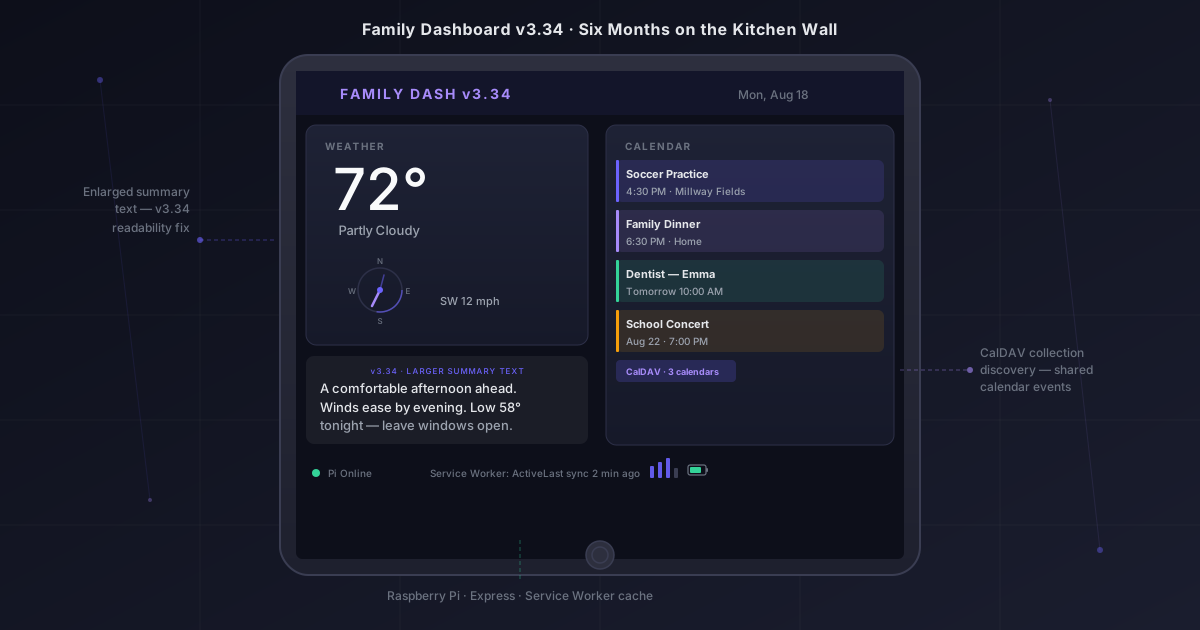
The commentary line was dropped. The weather narrative engine — which converts raw OpenWeatherMap data into a short prose summary — had been appending a second sentence after the forecast description. The intent was to add personality: something like "A good day to leave the windows open" following a more clinical "Comfortable and breezy through the afternoon." In practice, the second sentence read as noise. The first sentence delivered the information. The second sentence restated the implication without adding anything that a person couldn't infer themselves. Cutting it made the panel quieter without making it less useful.
The summary text is now larger. The CSS font size for the weather summary block was bumped upward. The exact increment matters less than the reason for it: the previous size was chosen at a desk. The actual reading distance is from the kitchen counter, or the doorway, or across the table. At those distances, the difference between a 12px and a 15px font is the difference between squinting and reading at a glance.
Neither change required a server-side modification. The weather narrative runs in Node.js on the Pi, but the font size is a client-side CSS value, and the commentary sentence was appended by a string concatenation that the server sent to the client in the weather response JSON. Removing it was a one-line deletion in the server's weather handler, and increasing the font size was a one-line change in the dashboard's stylesheet.
Why the Commentary Line Existed in the First Place
The original narrative engine was designed to make the weather panel feel less like a data readout and more like something a person wrote. That goal is reasonable for a family display — it should feel approachable, not clinical. The implementation followed a template pattern: a primary sentence describes current conditions and the near-term forecast, and a secondary sentence offers an observation or recommendation based on the data.
The secondary sentence was generated from a lookup table that matched condition codes to phrases. High humidity + rising temperature in the afternoon might produce "Might feel muggy by midday." Clear skies with low wind produced "Good drying day if you have laundry." Overcast with a chance of evening showers generated "Leave an umbrella in the car."
These phrases passed the desk test. Reading them while building the feature, they felt useful and personable. Reading them from across the kitchen six months later, they felt like filler. The useful information was always in the first sentence. The second sentence was the weather narrative equivalent of a landing page that says "Empowering your business to succeed" — technically coherent, zero information density.
The decision to cut it was made at the wall, not at the desk. That distinction is worth noting: the same judgment call that produced the wrong answer in a development environment produced the right answer when evaluated in the deployment environment. Software for physical spaces needs to be reviewed from where the users actually stand.
Font Size as a First-Class UX Decision
The weather summary text increase is the less dramatic of the two changes, but it's the one with more lasting implications. Font size on a wall display is not a styling detail — it's the primary interface between the software and the person who needs to know whether to bring a jacket.
The previous size worked at the desk because screens at desk distance are close. The same text at three or four meters looks fine in a screenshot but requires leaning forward in the real environment. A display that requires leaning forward is a display that will eventually be ignored in favor of asking someone, checking a phone, or just going outside and finding out.
The readable threshold for the weather summary on this specific iPad, at this specific mounting height and room distance, turned out to be around 15-16px. The previous value was 12px. Three to four pixels is not a meaningful change in a CSS stylesheet. Three to four pixels at reading distance from across a kitchen is whether the panel communicates in a glance or requires active effort.
The broader principle is that responsive design frameworks optimize for viewport width — they adjust layout for different screen sizes but typically keep font sizes constant once a breakpoint is satisfied. A wall display is a use case those breakpoint systems don't model. The screen is large, so the layout breakpoint gives a desktop layout, but the reading distance is far, so the font size that works for desktop browsing is too small. Handling that gap requires thinking about the deployment environment independently of the viewport dimensions.
The CalDAV Foundation Underneath
The weather changes in v3.34 are cosmetic in the best sense — they improve the daily experience without touching the underlying data pipeline. That pipeline has seen more structural work in the past two months than in all previous versions combined, and it's worth briefly recapping what the June update added because it's what makes the calendar panel on the right side of the dashboard reliably useful.
Before May 2026, the calendar integration fetched events from a single CalDAV URL — the primary calendar URL stored in the environment file. This worked for events created by the account owner. It missed every event that came from a shared or invited calendar, because Google Calendar's CalDAV interface stores those in separate collection URLs that have to be discovered through a three-step PROPFIND chain rather than fetched directly.
The May update implemented that chain: a PROPFIND request to / discovers the current-user-principal URL, a second PROPFIND against that URL finds the calendar-home-set, and a third PROPFIND with Depth: 1 against the calendar-home-set enumerates all calendar collections including shared ones. The server filters those collections for VEVENT support and fetches events from each, deduplicating by UID to prevent the same event from appearing twice if it shows up in multiple collections.
The result is that the dashboard now shows the complete picture of what the family has on — not just the events one person added to their own calendar. That's the functional threshold where a family dashboard becomes genuinely useful rather than just a nice-looking clock with some appointments on it.
What Six Months of Production Has Revealed
Beyond the specific bugs that were fixed, running the dashboard continuously for six months has produced a set of observations that are harder to articulate as individual issues:
The service worker is load-bearing. The Pi reboots occasionally — for system updates, for power interruptions, for the occasional SD card filesystem check. Every time it does, the iPad is no longer connected to the Express server. Before the service worker was added in v3.32, a Pi reboot meant a broken dashboard until someone noticed and reloaded manually. With the service worker caching the last known state, a Pi reboot shows stale data for a few minutes rather than a broken page. Stale weather is a minor inconvenience. A broken dashboard that needs manual intervention is a reliability failure that erodes trust in the whole system.
The refresh interval matters more than it seemed. The dashboard polls the Pi server for updated weather and calendar data on an interval. Setting that interval involves a tradeoff: more frequent polls keep the data fresh but generate more network activity and more API requests against the OpenWeatherMap quota. Less frequent polls are cheaper but let the weather display age visibly. Six months of watching the display has clarified the acceptable staleness threshold: weather data that's 15 minutes old reads as current at a glance, because weather doesn't change noticeably in 15 minutes. Calendar data that's 5 minutes old is acceptable because calendar events don't change minute-to-minute. The two panels have different acceptable staleness, and the refresh intervals reflect that.
The iPad's age is a real constraint. The display runs on an older iPad that was chosen specifically because it was available and could be dedicated to the dashboard. Its CPU is slower than current hardware, and JavaScript that runs imperceptibly on a development machine can produce visible jank on the iPad. This has shaped two decisions that might seem overcautious on faster hardware: the dashboard avoids CSS animations beyond simple transitions, and weather narrative generation runs entirely on the server and arrives as pre-computed text rather than being assembled in the browser. Both choices eliminate processing that the iPad doesn't need to do and that a server can do more cheaply.
What Stays the Same
v3.34 changes two things and touches nothing else. The architecture that has been in place since the Raspberry Pi migration — Express server, environment-variable credential storage, CalDAV proxy, OpenWeatherMap integration, service worker cache — is unchanged. The dashboard still runs as a Node.js process, still serves a single HTML page with vanilla JavaScript, and still has zero npm dependencies beyond what's needed for the HTTP server and CalDAV requests.
That stability is intentional. A family dashboard that requires maintenance has a hidden cost paid in the time it takes to notice something is wrong, diagnose it, and fix it. The versions that have shipped since April have each addressed a real problem observed in production — a missing calendar event, a wind direction panel defaulting to north, a font too small to read from across the room. None of them required changes to the fundamental architecture because the fundamental architecture has been correct from the start.
The next version will probably address something else that the wall reveals. That's the development model for a project like this: observe the deployment environment, fix what breaks the daily experience, leave working things alone.